It’s no secret that Divi comes with a ton of options. And sometimes, some of these options might seem to deliver similar outcomes. It’s important to know the difference and how and when to use them. Negative margin and transform translate are two of those design options that can deliver a similar outcome and in some situations, using one instead of the other can make more sense.
In this post, we’ll make it easier for you to choose the right design option by showing you the difference between both, where you can find them in the Divi builder and how to use them to your advantage to create stunning web designs.
Let’s get to it!
How Negative Margin Works
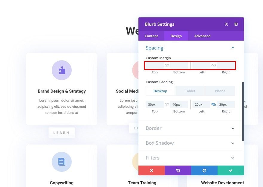
Negative margin remains one of the most used techniques in web design and design in general. It can quickly and effortlessly add an extra dimension to any website you create. Now, in Divi, you can basically add negative margin to any design element on your page. Whether you want to add an overlap to a section, row or module, you’re able to find these options in the spacing settings by going to the design tab.
You get to choose what kind of overlap you want to create; bottom to top, top to bottom, left to right or right to left. It’s also important to take the Z Index of your element into account. The most common overlaps happen from bottom to top because of the element’s higher Z Index.
Check out this tutorial to see some great overlap examples that are created with negative margin.
How Transform Translate Works
Transform translate has an entirely different approach, one that is a lot more visual as well. When you add negative margin to the spacing settings of an element, you have to manually enter a value in a unit of your choice (pixel, viewport, …). You’ll see that value turn into action on your page (in real time) and you can continue modifying the value as you go.
In contrast to negative margin, the transform translate design option is a lot more visually-oriented. It gives you an axis that represents the width and height your page, and you can use your pointer to position the element wherever you want on the page. You can find the transform translate design option by going to the transform options in the design tab of any element. There, you’ll have to enable the second tab.
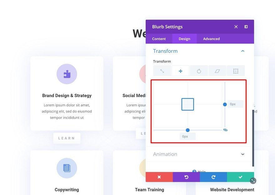
One of the big differences between transform translate and negative margin, however, is what is being left behind. If you’re changing the position of an element using the transform translate option, the initial space that is taken up by the module will remain. With negative margin, the opposite is true.

Creating Small Overlaps? Go for Negative Margin
Top Negative Margin
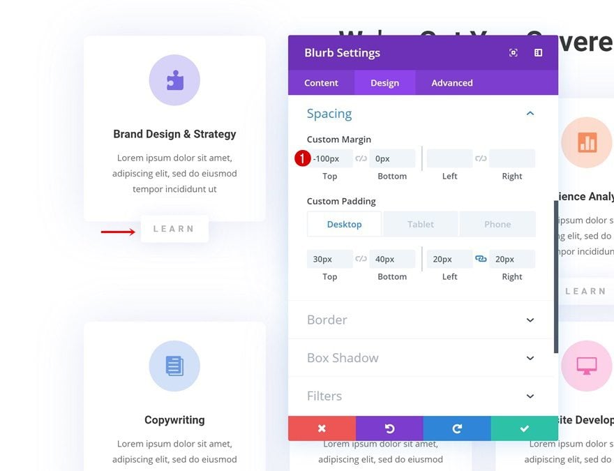
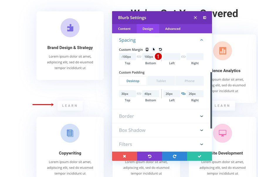
If you want to create an upward overlap, you’ll have to add a negative value to the top margin of your element. After adding the negative top margin, any module that comes below the module, in the same column and row, will follow. In other words; the negative margin will apply to all modules that are present in a particular column.
If you want to avoid that, you’ll have to add some custom bottom margin as well. Use the same amount of pixels as you did for the top overlap (without the minus).
Left & Right Negative Margin
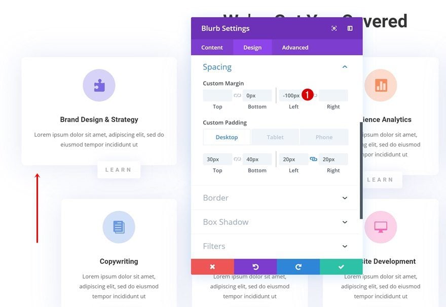
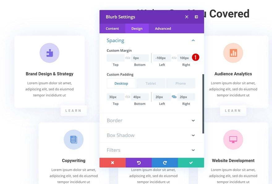
If you’re adding negative margin to the left or right side of an element, it’s necessary to add that same amount of pixels (without the minus) to the other side. If you add it to one side only, you’ll see the module increase in size:
By adding the same value without the minus to the other side, you’re making sure the module keeps the same size it had before.
Creating Bigger Overlaps? Go for Transform Translate
If you’re creating bigger overlaps, it’s better to choose the transform translate option. It works entirely different from negative margin. First of all, it doesn’t take any page structure into account. It visually repositions the element without taking the container sizes that are present on that page into account. Secondly, it helps you position the element exactly where you want to without having to manually modify the values.
Add all Elements to Bottom of Section
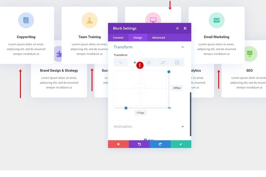
When using the transform translate option on a design element, you have to bear in mind that is leaves behind the space it initially takes up. In most situations, you want to get rid of that space and luckily, that’s possible as well. Start by adding the modules to the bottom of your section (in a separate row) and reposition them upwards using the transform translate option.

Hide Overflow & Change Section Height
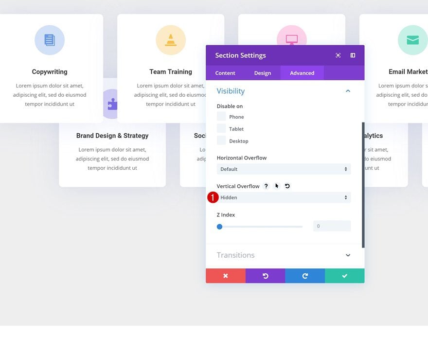
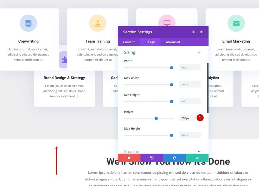
Once you’re done repositioning the elements in your section, you can define a height for your section. At the bottom, you’ll have quite some space that is taken up by the repositioned elements which you want to get rid of. Open the section settings go to the overflow settings first. Hide the vertical overflow. Then, go to the sizing settings of your section and choose a matching height for the section (across different screen sizes).
Final Thoughts
Divi’s continuously evolving features can sometimes make it difficult to understand the difference between two design options that allow you to achieve similar results. But although some options might seem the same, there are differences that can help you make a decision between both options. In this post, we’ve shown you what the difference between both is, where you can find them in the Divi Builder and how to use them to your advantage when designing any kind of website. If you have any questions or suggestions, make sure you leave a comment in the comment section below!
If you’re eager to learn more about Divi and get more Divi freebies, make sure you subscribe to our email newsletter and YouTube channel so you’ll always be one of the first people to know and get benefits from this free content.
The post Using Transform Translate vs. Negative Margin with Divi appeared first on Elegant Themes Blog.
