Your brand’s logo has to live in umpteen different places, from a tiny favicon on your website to an enormous billboard on a busy highway. Even within your website, there are different locations for your logo to go, and in varying orientations and sizes. And every single time you use your logo – or a variation of if – it has to be consistent, crisp and recognizable.
When you know the different logo dimensions and sizes you’ll need from the start, it’ll be a lot easier to add it to your website – and to your social media, print products and all other brand collateral.
Logo Variations
For the most part, logos have three elements: the company name, an icon and a slogan. Or, you can think of a logo as having two main components: the image or symbol and the typography or wordmark. Ultimately, you can use these elements together or separately, but no matter how they’re arranged, they should reflect your brand.
One logo can have several variations when it comes to design, dimensions, orientation, shape and size. The context where you use the logo – for our purposes, where it goes on your website – determines the version of the logo you choose. And every time you adapt your logo to a different background or size, the goal is for it to retain its integrity.
Here are common logo variations that you should consider creating for use on your website and elsewhere:
- Horizontal, square and vertical
- Black, white, full color and inverse color
- Regular background and transparent background
- Full logo, icon only and limited text or single letter/monogram
All of the different logos you create, along with details of where they should be used, should be included in your brand kit, too. And if you’re not creating your logo variations yourself, know that the agency or designer who’s creating them should send all of the variations along with the original, primary logo.
Logo File Types
The file type affects what the logo looks like as it’s scaled up and enlarged. If you create the logo using a non-scalable file type, it will look blurry and pixelated as it gets larger. You don’t want this – you want your logo to look detailed and perfect, whether it’s tiny or enormous.
In order for your logo to be scalable without losing quality, it should be in vector format, preferably as a PNG file. A PNG is a lossless compressed file, which means that the file size is pretty small, but the quality of the design is maintained. You can also use a transparent background with a PNG file, which is excellent for websites and other digital spaces. When displaying a logo online, your PNG file should be less than 200KB in order for load time to be fast.
You may be more familiar with JPG files, but you don’t want to use a JPG for your logo. This type of file is lossy compressed, not lossless compressed. While it takes up less space than a PNG because the file size is a bit smaller, the quality is worse, and your logo may look pixelated, especially as you try to scale it up.
Choosing a Logo Size for Your Website
Your logo will go in two primary places on your website: the favicon and the navigation bar. Let’s go over specific dimensions for those places.
Favicon Logo Size
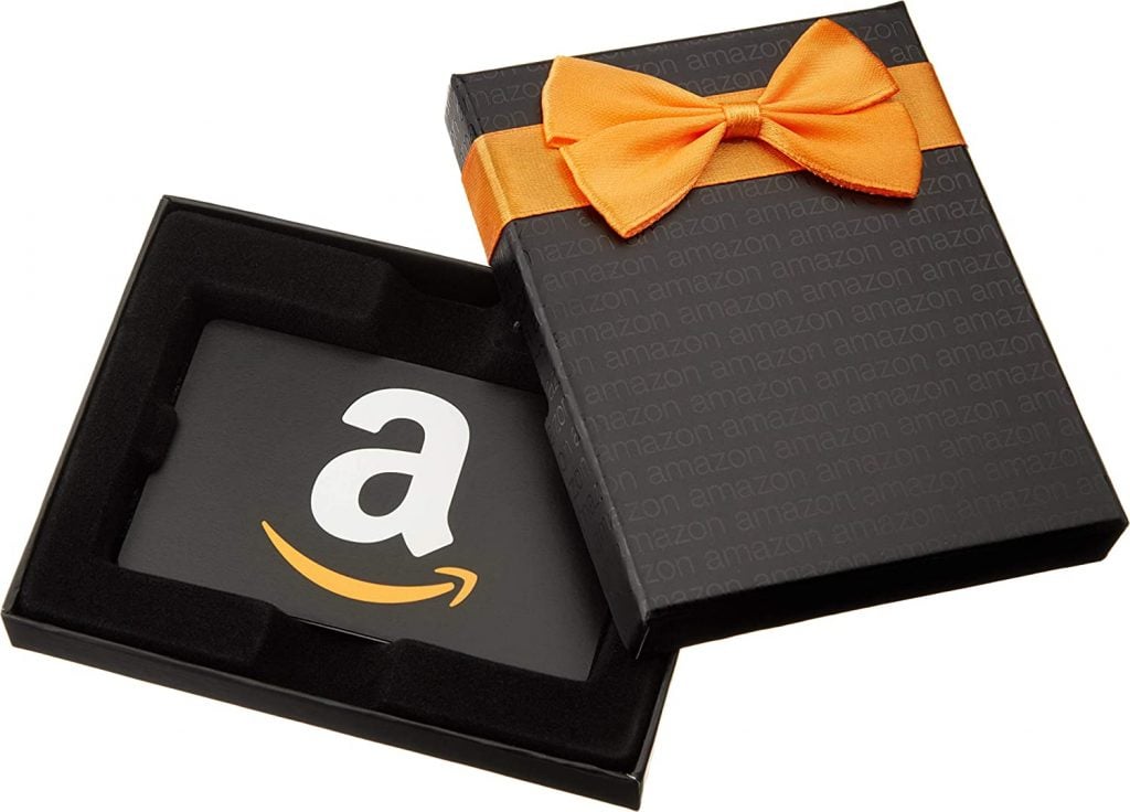
In a small space like the favicon, you should use your icon-only logo since the area will be too small for any text to be readable. Or, if your logo is a word, you can use either the first letter of the word or a monogram version if there are two or more words. In the example below, you’ll see Amazon’s one-letter logo that’s used in various places, including on some of their gift cards:

Source: Amazon
P.S. The favicon is the tiny icon that shows up next to the webpage title in the search bar, and it’s also what will appear in a bookmarks or favorites list.
![]()
Standard favicon sizes are as follows:
- 16 x 16 pixels (most common)
- 32 x 32 pixels
- 48 x 48 pixels
Navigation Bar Logo Size
The navigation bar or header of your website will be home to your logo – probably the full, standard one. Typically, the logo will sit on the left side of the navigation bar.

While the exact sizing will depend on your specific website builder, it’s likely that the size options will be approximately as follows:
- Full banner: 468 x 60 pixels
- Horizontal layout: 250 x 150 pixels; 350 x 75 pixels; or 400 x 100 pixels
- Vertical layout: 160 x 160 pixels
Those aren’t the sizes of the actual header – the headers will be larger – but they’re the sizes to consider when designing your logo to fit into those types of website headers.
Other Places You’ll Use Your Logo
If you’re going to create variations of your logo for your website, it’s also a good time to make the versions you’ll need for other places, too. For example:
- Digital ads and banners will require a logo.
- On social media, you’ll need your logo in backgrounds, banners, cover photos, profile pictures, posts and thumbnails.
- For brands with an online shop that sells physical materials, you may need your logo printed on magnets, mugs or t-shirts.
- If you sell or send physical materials, you’ll put your logo on shipping material, like boxes, envelopes and maybe even packing tape.
Tools like Canva have ready-to-go templates with the ideal sizes for graphics in various locations, like your Facebook cover photo or a Stories post on Instagram. You can pop your logo into the template and then download the final design to use wherever you need it.
Final Thoughts About Logo Size for Your Website
When it comes to your logo, its variations and where you place them on your website, remember that this is creative and design-centric – there are no hard-and-fast rules that you must follow. And since it’s not a perfect science, you can use your artistic eye and best judgment to decide what to use where. Your logo communicates a lot about your company, and it’s one of your branding elements that will influence audience perception. It should look clear and high-quality, no matter where it’s used.
Is your logo ready to go? Here’s how to add a custom logo image in Divi. You may also like our article with simple and creative ways to display your logo in Divi.
Featured Image via Mas Blend / shutterstock.com
The post What is the Best Logo Size for a Website? appeared first on Elegant Themes Blog.

